


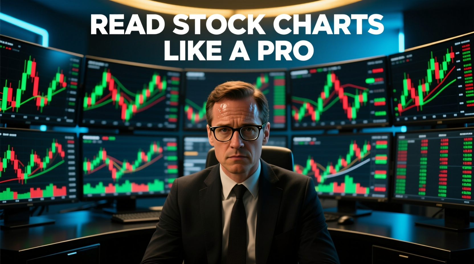
Reading Stock Charts Like a Professional
The stock market is a vast, ever-shifting landscape, and if you want to navigate it successfully, understanding stock charts is not just useful—it’s essential. Charts are the heartbeat of the market. They tell stories of investor sentiment, of supply and demand, and of the hidden patterns that govern price movements. Reading them like a pro isn’t about luck; it’s about learning to speak the language of the market.
Walk into any trading floor, virtual or physical, and you’ll see screens filled with colorful lines, bars, and candles dancing across monitors. To the untrained eye, it looks like chaos—random numbers and squiggles that seem to defy comprehension. But to those who’ve learned to read this visual language, these charts reveal a world of opportunity, risk, and strategic decision-making. They are maps that guide traders through the wilderness of financial markets, pointing toward potential profits while warning of dangers ahead.
At their core, stock charts are visual representations of a stock’s price over time. Think of them as the fingerprints of market behavior, unique and telling. The simplest form is the line chart, which tracks closing prices and gives a clean, high-level view of a stock’s trajectory. Line charts are straightforward and elegant—they connect the dots between closing prices day after day, creating a continuous line that shows whether a stock is climbing, falling, or moving sideways. They’re perfect for getting a quick snapshot of long-term trends, for stepping back and seeing the forest rather than obsessing over individual trees.
But for professional traders, line charts are just the tip of the iceberg. They’re the introduction, not the full story. Candlestick charts, with their rich detail, are where the real insights lie. Originating in 18th-century Japan, where rice traders used them to track market prices, candlestick charts have evolved into one of the most powerful tools in technical analysis. Each candlestick shows the open, high, low, and close prices for a given period, revealing the balance of power between buyers and sellers in a way that line charts simply cannot.
The anatomy of a candlestick is beautiful in its simplicity. The rectangular body shows the opening and closing prices—if the close is higher than the open, the body is typically white or green, indicating a bullish session. If the close is lower than the open, the body is black or red, signaling a bearish session. The thin lines extending above and below the body, called wicks or shadows, represent the highest and lowest prices reached during that period. These wicks tell you about rejection—they show where the market tested a price level but couldn’t sustain it. A long upper wick might indicate that sellers pushed back aggressively when buyers tried to drive prices higher. A long lower wick suggests that buyers stepped in forcefully when sellers tried to push prices down.
To read charts like a pro, you need to understand trends. Trends are the market’s direction, its rhythm, its underlying current. Everything in technical analysis builds on the concept of trends because trends represent the path of least resistance—the direction the market wants to go. An uptrend is marked by higher highs and higher lows—a clear signal that buyers dominate and are willing to pay progressively more for a stock. Each dip is shallower than the last, each peak reaches new heights. This stair-step pattern upward reflects growing optimism, increasing demand, and a market where ownership is valued more with each passing session.
A downtrend is the opposite, with lower highs and lower lows, signaling selling pressure and declining confidence. Each rally is weaker than the previous one, each drop takes prices to new lows. Downtrends can be brutal, grinding down optimistic traders who keep trying to catch a falling knife. They reflect fear, pessimism, or simply the recognition that a stock is overvalued and needs to find a lower, more appropriate price level.
But the market is rarely linear. Trends can pause, reverse, or consolidate, creating zones of support and resistance. These pauses are where the real drama unfolds, where bulls and bears meet in combat to determine the next directional move. Support is the price level where buyers step in to prevent further decline, acting as a floor beneath prices. It’s where value hunters see opportunity, where long-term investors add to positions, where traders place their buy orders in anticipation of a bounce. Support levels form because market participants remember previous price points and react accordingly. If a stock bounced strongly from a certain price before, traders expect it might do so again.
Resistance is where sellers emerge to cap gains, creating a ceiling above prices. It’s where profit-takers close positions, where short-sellers see opportunity, where the supply of shares overwhelms demand. Resistance often forms at previous highs because shareholders who bought at those levels and watched their positions decline are eager to exit at breakeven. Or it forms where round numbers create psychological barriers—a stock at ninety-eight dollars faces natural resistance at one hundred simply because humans like round numbers and make decisions around them.
Recognizing these levels allows traders to anticipate potential reversals and entry points. When price approaches support, a professional trader watches carefully. Will it hold? Will buyers defend this level with conviction? If support holds and price bounces with strong volume, that’s a potential buying opportunity. But if support breaks—if sellers overwhelm the buyers and price crashes through that floor—what was support often becomes new resistance, and the downtrend accelerates. The psychology behind this flip is fascinating: traders who bought at support now find themselves underwater and eager to sell if price rallies back to their entry point.
Beyond trends, patterns are crucial. Patterns are recurring formations that indicate potential future price movements, the market’s way of repeating behaviors because human psychology remains constant. Classic chart patterns like head and shoulders, double tops and bottoms, triangles, and flags have been studied for decades. They offer a roadmap for possible breakout or breakdown points, giving traders clues about where the market might head next.
The head and shoulders pattern is perhaps the most famous reversal pattern in technical analysis. Picture a rally that forms three peaks, with the middle peak—the head—higher than the shoulders on either side. This formation suggests that buyers are losing strength. The first shoulder shows enthusiasm, the head shows maximum effort as buyers push to new highs, but the second shoulder reveals exhaustion—buyers can’t even match the height of the head. When price breaks below the neckline connecting the two shoulders, it confirms the pattern and often triggers significant selling. The pattern works because it tells a psychological story: optimism peaked, failed to sustain, and now fear takes over.
Double tops and bottoms are simpler but equally powerful. A double top occurs when price rallies to a high, pulls back, rallies again to approximately the same high, and fails. That second failure to break through resistance signals that buyers are spent, that the uptrend is over. Conversely, a double bottom shows price falling to a low, bouncing, falling again to test that low, and holding. That successful test of support suggests that sellers are exhausted and a rally may be coming.
Triangle patterns—ascending, descending, and symmetrical—represent periods of consolidation where the range of price movement gradually contracts. Imagine a stock bouncing between converging trendlines, creating lower highs and higher lows that squeeze together. This compression builds tension like a coiled spring. Eventually, price breaks out of the triangle, often with explosive momentum in one direction or the other. Ascending triangles, with flat resistance and rising support, tend to break upward. Descending triangles, with flat support and declining resistance, tend to break downward. Symmetrical triangles can break either way—the market is genuinely undecided, and the breakout direction reveals which side won the battle.
Flag patterns are continuation patterns that occur after strong moves. Picture a sharp rally—a flagpole—followed by a tight, consolidating pullback—the flag. The flag represents profit-taking and a brief pause before the trend resumes. When price breaks out of the flag in the direction of the original move, it often continues with renewed momentum. Flags are favorites among momentum traders because they offer relatively low-risk entry points in strong trends.
Candlestick patterns provide additional nuance, adding granular insight to these broader chart formations. A hammer, appearing after a decline, shows a session where sellers pushed price much lower but buyers rallied strongly to close near the high. That long lower wick and small body near the top signal potential reversal—sellers couldn’t hold their gains, buyers showed up with force. A shooting star is the opposite, appearing after a rally, with a long upper wick showing that buyers pushed higher but sellers knocked price back down. It warns of potential exhaustion in the uptrend.
A bullish engulfing pattern occurs when a large green candle completely engulfs the previous session’s red candle, signaling a shift in momentum from sellers to buyers. The psychology is clear: whatever negativity drove prices down the prior session has been overwhelmed by buying pressure. Conversely, a bearish engulfing pattern—where a large red candle engulfs a prior green candle—suggests that sellers have seized control from buyers.
Doji candles, where open and close are virtually identical, reveal indecision. The market struggled all session but ended where it began, showing equilibrium between buyers and sellers. At key levels, dojis can signal potential reversals because they show that the dominant side is losing conviction. Morning star and evening star patterns, three-candle formations showing transitions from downtrend to uptrend or vice versa, are among the most reliable reversal signals in candlestick analysis.
Volume is another vital component, and arguably the most underappreciated by novice traders. A price move without corresponding volume is often weak and unsustainable, like a car trying to accelerate without fuel. Volume confirms trends and validates breakouts. Think of volume as the conviction behind price movement. When a stock rallies on heavy volume, it tells you that many participants are involved, that the move has broad support, that real money is flowing in. That’s a rally you can potentially trust.
A sudden surge in volume on a breakout above resistance suggests strong buying interest, institutional money perhaps, traders who’ve been waiting for confirmation that the stock is ready to move higher. Volume surges act as fuel for price movement—they create momentum that can carry a stock much further than the initial breakout point. Professional traders watch for volume spikes because they signal that something important is happening, that the market’s attention has focused on this particular stock.
But low volume on a rally might warn of a potential false move. If price grinds higher on thin volume, it suggests that few participants are interested, that the move is driven by a small number of trades, that there’s no conviction behind it. Such rallies often fail quickly because there’s no support underneath them. Similarly, a decline on low volume is less concerning than a plunge on heavy volume. Light selling can reverse easily; heavy selling indicates real fear and urgency to exit positions.
Pro traders never ignore this crucial metric—it’s the pulse behind the price action. They understand that volume analysis can distinguish between meaningful moves and noise, between trend continuations and false breakouts. Some traders use volume moving averages, comparing current volume to the average over recent periods. Volume significantly above average signals important market events; volume below average suggests lack of interest and potential consolidation.
Reading charts like a professional also means using technical indicators wisely. The landscape of technical indicators is vast—hundreds of mathematical calculations designed to extract insights from price and volume data. But more isn’t always better. Professional traders typically use a small set of indicators they understand deeply, rather than cluttering their charts with every indicator available. Moving averages smooth out price action to highlight trends, filtering out the daily noise to reveal the underlying direction. A simple moving average calculates the average price over a specified period, creating a line that rises in uptrends and falls in downtrends.
The fifty-day and two-hundred-day moving averages are particularly significant because institutional investors watch them closely. When a stock’s price crosses above its two-hundred-day moving average, it’s seen as a bullish signal—the long-term trend has shifted upward. When price crosses below, it’s bearish. The golden cross, where the fifty-day average crosses above the two-hundred-day average, is considered one of the most reliable bullish signals in technical analysis. The death cross, the opposite, warns of potential long-term decline.
Exponential moving averages give more weight to recent prices, making them more responsive to new information. Many traders prefer EMAs for this reason—they adapt more quickly to changing market conditions. The twelve and twenty-six day EMAs form the basis for one of the most popular momentum indicators.
The Relative Strength Index, or RSI, measures the speed and magnitude of price changes, oscillating between zero and one hundred. Readings above seventy suggest a stock is overbought—perhaps extended too far too fast and due for a pullback. Readings below thirty suggest oversold conditions—possibly presenting a buying opportunity if the longer-term trend is intact. But RSI works best when understood in context. In strong uptrends, a stock can remain overbought for extended periods. In strong downtrends, oversold readings can persist. Professional traders use RSI as one input among many, not as a standalone signal.
The Moving Average Convergence Divergence, or MACD, helps gauge momentum and potential reversals by comparing two exponential moving averages. When the MACD line crosses above the signal line, it suggests building bullish momentum. When it crosses below, it suggests bearish momentum. Divergences between MACD and price are particularly interesting—if price makes new highs but MACD doesn’t, it warns that momentum is fading and a reversal may be near. If price makes new lows but MACD doesn’t confirm, it hints that selling pressure is exhausting and a bottom may be forming.
Bollinger Bands plot standard deviations around a moving average, creating an envelope that expands during volatile periods and contracts during quiet periods. When bands narrow—the squeeze—volatility is low and a big move may be brewing. When price touches the upper band repeatedly, the stock may be strong but extended. When it bounces off the lower band, it may have found support. Walking the bands—when price consistently touches the upper or lower band—indicates exceptional strength or weakness.
But these tools are only guides. They are not guarantees, not magic formulas that print money. The real skill lies in combining visual chart analysis with indicator insights to form a coherent trading strategy. Indicators can conflict, can give false signals, can lag behind price action. A professional understands that indicators are best used to confirm what price action is already suggesting, to validate a hypothesis rather than create one from scratch. Price action is primary; indicators are secondary.
Emotional discipline is part of the equation, perhaps the most important part that no indicator can teach. Charts can trigger fear and greed, and even the clearest patterns can fail. The market is probabilistic, not deterministic. A perfect setup can fail because of unexpected news, because of algorithms executing large orders, because of macro events nobody predicted. Pro traders develop the ability to trust their analysis while respecting the market’s unpredictability. They prepare for different scenarios, asking themselves: what if I’m right, what if I’m wrong, what’s my plan for each outcome?
Risk management becomes second nature. Stop-loss orders are placed to limit damage if a trade moves against them. Position sizes are calculated so that no single loss can devastate an account. The mathematics of risk-reward ratios guide every decision—a professional might demand that potential profit be at least twice, preferably three times, the amount they’re risking. This discipline ensures that even with a modest win rate, they remain profitable over time.
They never let emotions override logic. Fear causes traders to exit good positions too early, to miss the best part of trends. Greed causes traders to hold too long, to refuse to take profits, to turn winners into losers. Revenge trading—jumping back into the market immediately after a loss, desperate to recover—destroys more accounts than any other psychological mistake. Professional traders accept losses as part of the business, review what went wrong, and move forward without emotional baggage.
Finally, reading charts like a pro takes practice and patience, thousands of hours of screen time, of studying, of making mistakes and learning from them. Study historical charts, replay past market movements, and analyze outcomes. Pick a significant historical event—a market crash, a massive rally, a sector rotation—and study how it unfolded on charts. What signals appeared beforehand? What patterns formed? How did volume behave? This kind of historical analysis builds pattern recognition, the intuitive sense that something important is happening even before conscious analysis confirms it.
Paper trading—simulating trades without real money—allows you to test strategies without financial risk. Track your decisions, record why you entered and exited positions, calculate your results. Over time, you’ll discover what works for you, which patterns you read best, which timeframes suit your personality. Some traders thrive on fast-paced intraday charts; others prefer the calmer rhythm of daily or weekly charts. There’s no single right approach—there’s only what works for you.
The more you immerse yourself in chart patterns, candlestick formations, and market rhythms, the more fluent you become in this visual language. It’s like learning to read music or speak a foreign language—awkward and slow at first, requiring conscious effort to translate each symbol. But with practice, comprehension becomes automatic, intuitive, natural. Over time, what once seemed like random price movements transforms into a story—one you can read, anticipate, and act upon.
You begin to see personality in charts, to recognize when a stock is strong or weak, trending or consolidating, about to break out or break down. You develop a sense for market rhythm, understanding that nothing moves in straight lines, that pullbacks in uptrends are buying opportunities rather than reasons to panic, that rallies in downtrends are selling opportunities rather than signals that the decline is over. You learn to be patient, to wait for your setup, to resist the temptation to force trades when conditions aren’t favorable.
Mastering stock charts is about more than making money—it’s about understanding the market’s heartbeat, its hidden stories, and the psychology driving every move. Behind every chart is a battle between fear and greed, between those who believe prices will rise and those who believe they’ll fall. Every candlestick represents decisions made by millions of participants, from individual retail traders to massive institutional funds managing billions. The chart doesn’t lie—it aggregates all information, all opinions, all trades into one visual representation of consensus value at each moment in time.
When you reach the point where you can glance at a chart and intuitively sense the balance of power between buyers and sellers, you’re no longer just a trader—you’re a chart reader, a market interpreter, a professional in every sense. You’ve joined the ranks of those who speak the market’s language fluently, who see opportunity where others see chaos, who navigate the ever-shifting landscape with confidence and skill. The journey is long, demanding, and humbling, but the reward is the ability to participate in markets with your eyes open, making informed decisions based on the weight of evidence rather than hope or fear. That’s what it means to read stock charts like a professional.